Balanced: A design system example in Figma
My current design project is an app called “Balanced.” I had the idea for a gamified wellness app that would include fitness, food as well as rest and knew I had to build it in Figma. Using Figma allows me to quickly and easily create a design system that includes reusable components and styles. This has allowed me to quickly get my ideas for the app visualized.
Please check out Balanced on Figma for the full experience.
AOT Redesign: A web design project
I’m currently working to redesign the webpage for the yoga studio where I teach accessible yoga in my free time.
Check it out in Figma here.
Figma Mobile Prototype Example
I’m in the process of redesigning my portfolio. To start this process I’m designing mobile first. My hope is to switch to a calmer theme. I’m using Figma to demonstrate it’s High-Fidelity prototyping ability.
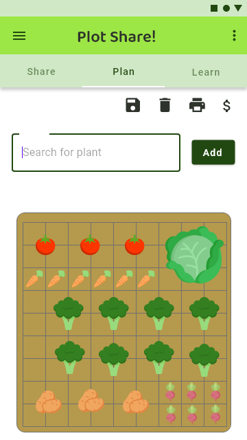
Plot Share
Plot Share is a prototype built with Adobe XD – to See the Full Project Click Here.
Flight Helper
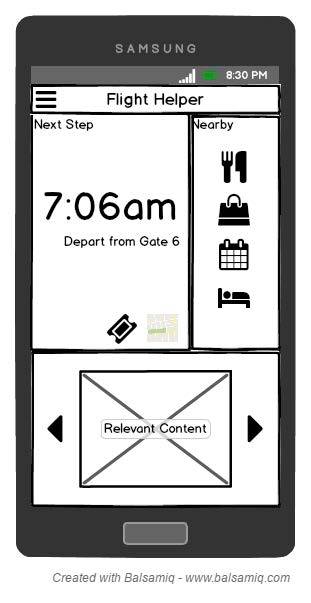
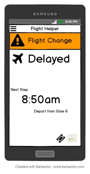
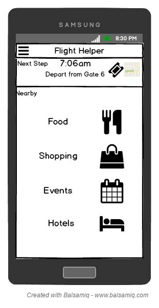
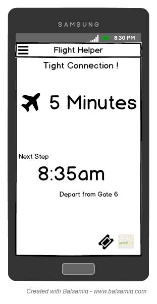
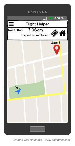
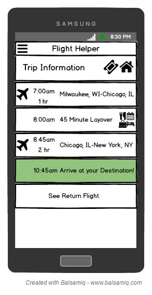
Flight Helper is a Balsamiq prototype of an application for flying. This app would allow users to see flight details, flight changes, nearby attractions as well as walk them through the steps of their flight.
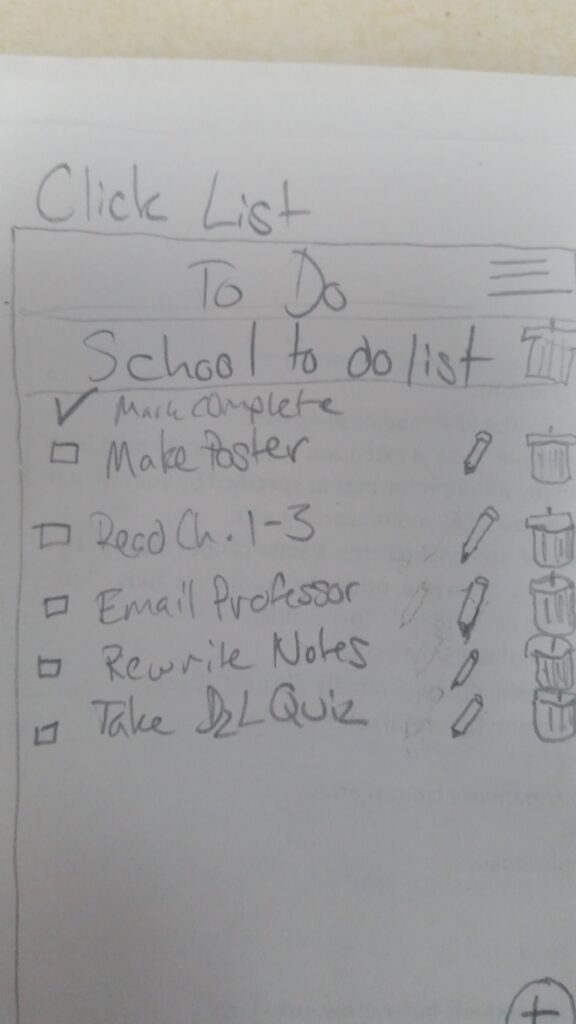
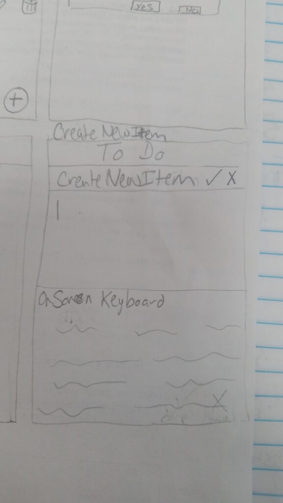
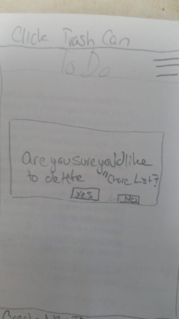
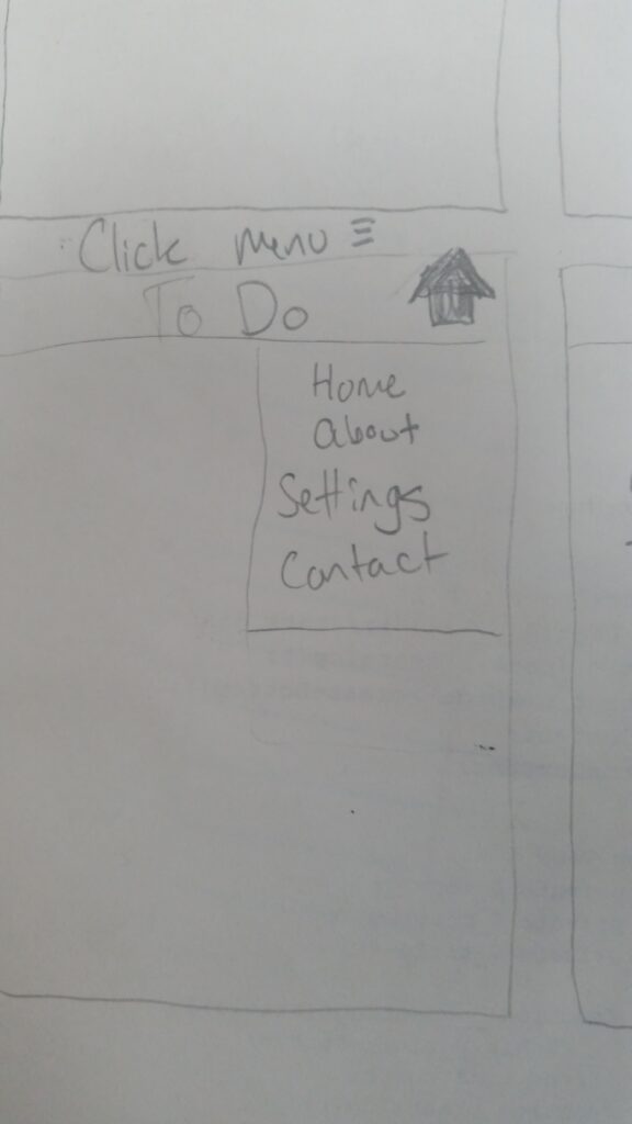
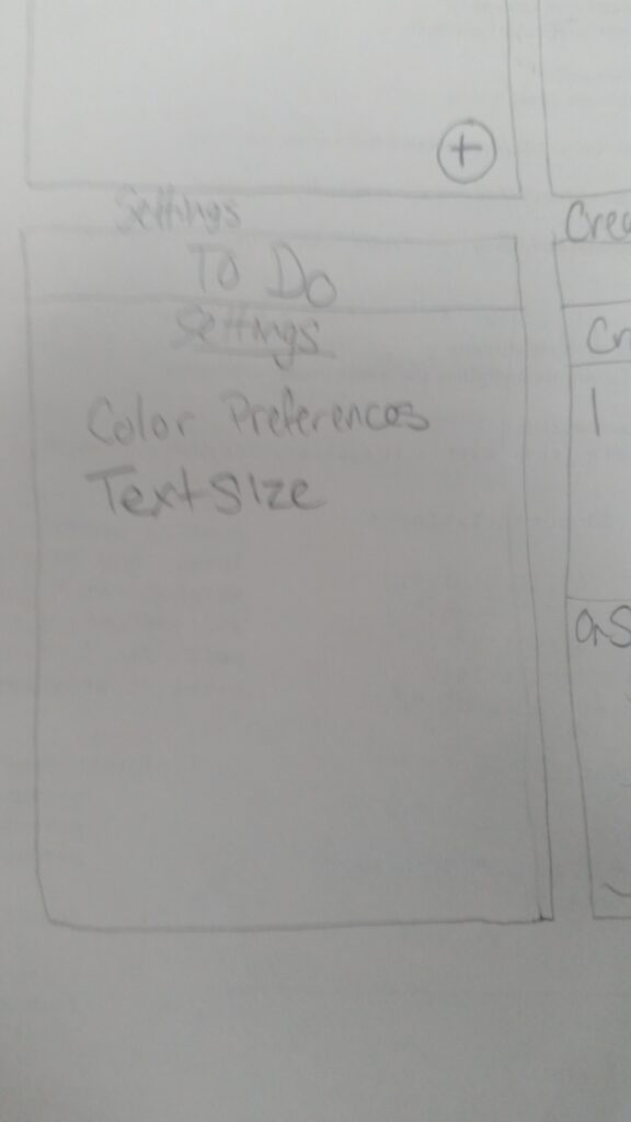
List App – A paper prototype
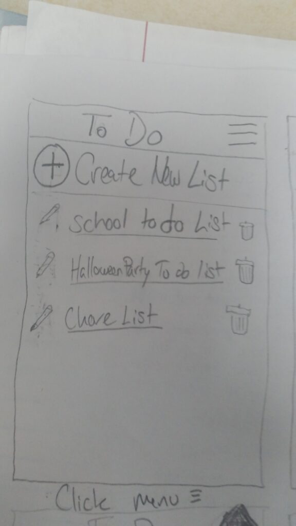
This prototype is a low-fidelity paper prototype. The purpose was to allow the user to create and manage lists.
Timesheet App
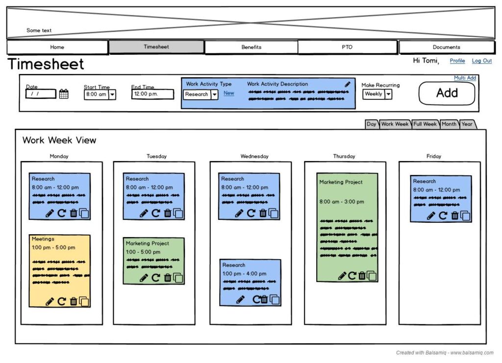
Here we see the dashboard on the week view of the app where users can see their timesheet and quickly add to it.
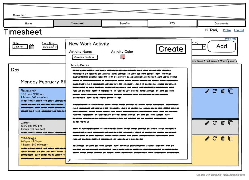
This screen shows the modal dialog that allows users to create a new item for their timesheet.
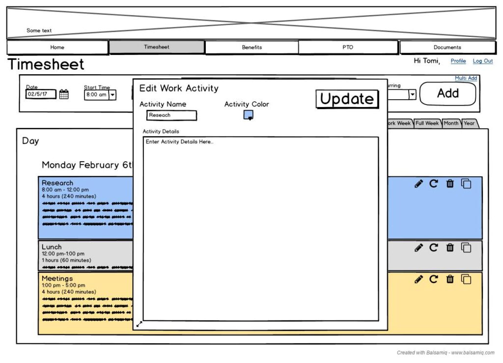
The update Dialog
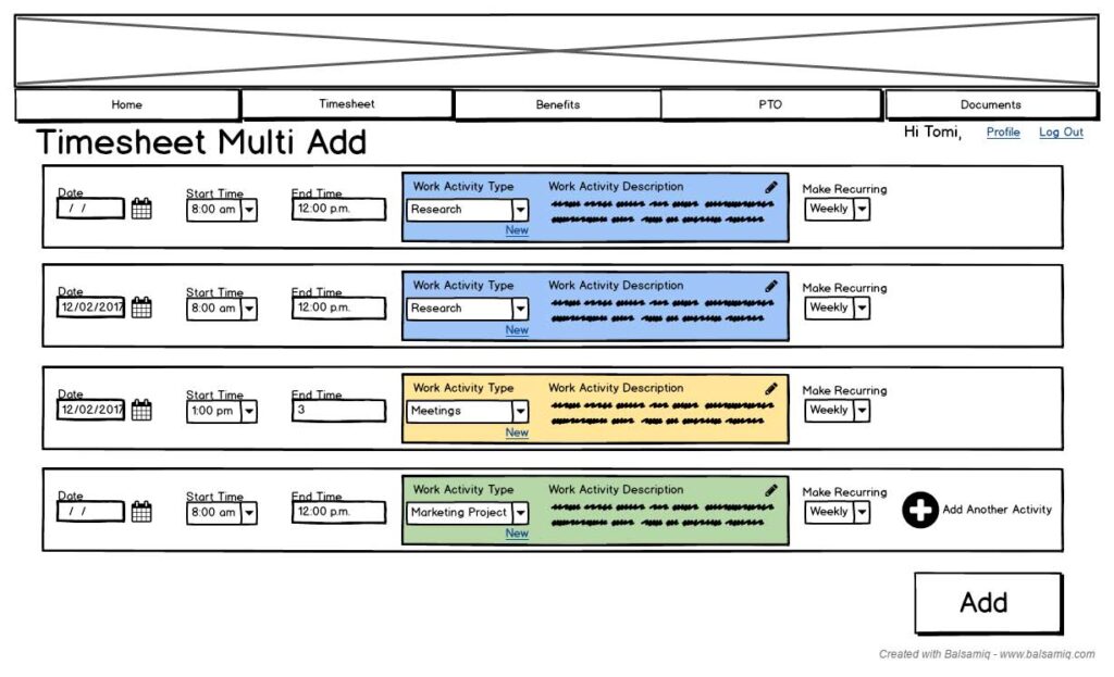
In this view, the user is able to add multiple items at once.
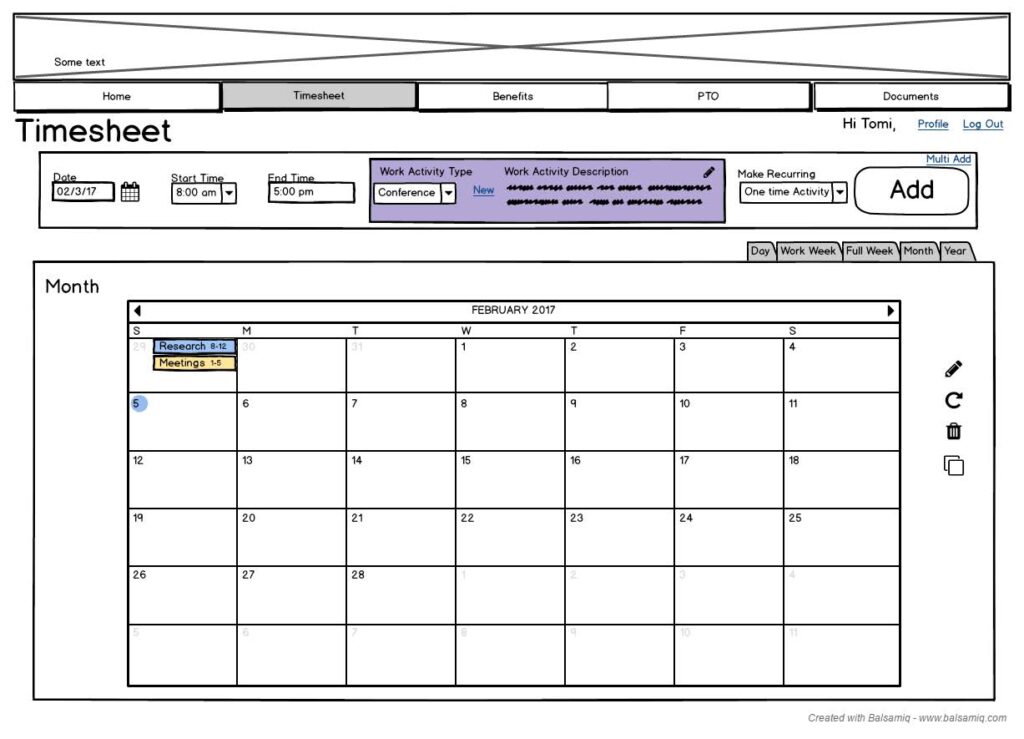
The month view provides users a bigger picture of their schedule.
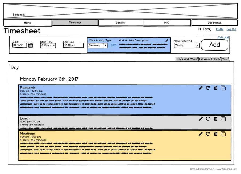
This screen shows the Day view of the users timesheet letting them see all of the individual items in their day.