UX Research Experience
This page is to highlight the research work I have experience conducting. UX research helps us to better understand our users which in turn guides better design. I’m an advocate for user research to bring the voice of the customer to the design process. Here are some of the UX research methodologies I’ve used:
- User Interviews
- Focus Groups
- A/B Testing
- Card Sorting
- Observational Research
- Surveys
- Analytics
User Interviews
User interviews are a quick and effective way to learn about users. Being able to just ask the user can be a very powerful tool.
While working with Lightning Pick I was able to advocate for a round of user interviews to learn about user needs for a new mobile app. We wanted to learn about users experiences with the current app to build a better version in Xamarin. We spoke with three identified user groups: internal engineers, site supervisors / management and lastly customer upper management. All three groups would use the app but have very different needs.
By conducting the interviews we were able to learn more about each group and this helped us prioritize what to improve in the new app.
Focus Groups
While working with Plexus, we aimed to create User Personas for a new replacement manufacturing application. Since the app would have many user groups we decided to conduct Focus Groups. These can be a great tool to learn about users and to learn about challenges in an existing application. By using the Focus Group methodology we were able to learn about users day to day and learn how different users needs were within a role.
A/B Testing
A/B testing is a great tool to compare two different designs. This can easily test two different designs or ideas. I was able to conduct an A/B test to try two different versions of the homepage of the Lightning Pick mobile app.
Card Sorting
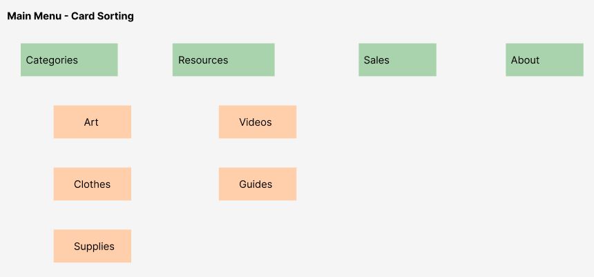
While rebranding the Nasco website we also wanted to redo the navigation. This was part of a larger effort to make an easier to use site. To tackle the navigation I used a card sorting activity. During a focus group with several stakeholders we did an activity to sort all of the content on the site into menu’s that made sense to our internal stakeholders and our customers. This allowed us to rearrange the website in a way that gave business owners more ownership of their areas and the end result for the user.

Observational Research
This method of User Research involves observing the user while they’re using the technology. This type of research helps us fully understand the existing processes and pain points. Observational research could be having participants come to a lab and have them complete tasks on a computer, it could be remote where we can watch a screen recording of a user taking actions while getting their feedback, or it could be observing the user in their natural environment for using the technology. This helps us understand context. Are they using the app on an airplane? Are they using it in a dark room? Or maybe somewhere crowded with many distractions?
While working with Plexus I had the amazing opportunity to conduct observational research. As part of the requirements gathering phase before design, I was able to visit the manufacturing facilities to observe processes in action as well as ask questions to better understand. This helped guide the requirements and then the designs.
Surveys
While with Nasco I created and monitored survey results on the site. The results helped drive the improvements we made to the eCommerce site.
Surveys can be a quick and affordable way to gather user feedback. One benefit of survey research is that it is easily quantifiable. This gives us data. We can understand what percentage of our users are struggling with a certain feature or how many users are completely satisfied with the checkout process for example.
Analytics
Lastly I do have experience with Analytics. I’ve worked with Google Analytics, Microsoft Power BI and some other built in analytics to various tools.
One project where I was able to use Google Analytics was the Nasco rebranding project. By looking at page traffic I was able to greatly clean up the site, prioritize the content that needed to be rebranded and create a better navigation experience.